Creating a component in Freestyle
This guide outlines the essential steps to create a custom Freestyle component in Zesty.io. It covers creating an HTML file in Parsley, capturing and using an image for the component, registering the component in Freestyle with necessary details, and verifying its functionality. Ideal for users seeking a straightforward approach to enhance their Zesty.io projects with custom components.
First, Install the Freestyle App to your instance from our marketplace.
Refer to installation guide here.
1. Create an HTML snippet
Start by navigating to the manager sidebar. Under the code tab, you will see a blue button that indicates 'Create File' with a plus icon. Click the button, and a dialog box will appear. Choose a file type from the list and set it to Snippet (html). Input your desired file name like /sample, you can also add the file inside a folder like this: /folder/sample . Click the "Create File" button, then add your HTML code and hit save.
2. Take a snapshot of the component
Navigate to the Media tab in the sidebar, then click the Upload button that appears in the upper right corner of the screen. Select your desired image, click "Open," and then click "Done." Verify that you have successfully uploaded your image by browsing the media content. Hover over the newly uploaded image and click the "Copy URL" button to save the image link to your clipboard. Save the link address in your notepad, as you may need it in the later steps.
Note: The image you choose will serve as the thumbnail for your component.
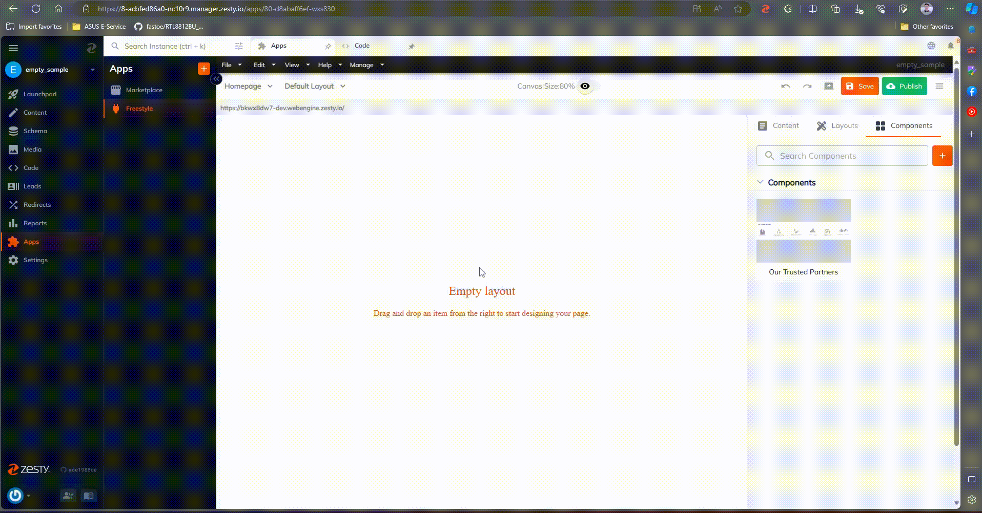
3. Register component in Freestyle
Navigate through Freestyle by clicking on "Apps" > "Freestyle". In the Freestyle interface, in the right corner, click the Components tab and click the orange plus icon. A dialog box will appear and you can set the details of your component.
Note: You might not be able to see the Freestyle app in the menu if you haven’t installed it on your instance.
- Name Field - Specify the desired name for your component.
- Classes Field - Set classes for your component.
- Type Field - By default it is set to component. There is no need to change this type of field.
- Droppable - Can be set to either true or false. By default it is set to false.
- Thumbnail Preview URL - Paste here the link of the image that you copied earlier
- Import HTML - Import the HTML using Parsley
4. Verify the newly created component
Check if the component is properly working by dragging and dropping it to the canvas.