
Managing a Custom Component
Add functionality and customization to your components. Connect them to your instance's content or your external front-end framework.
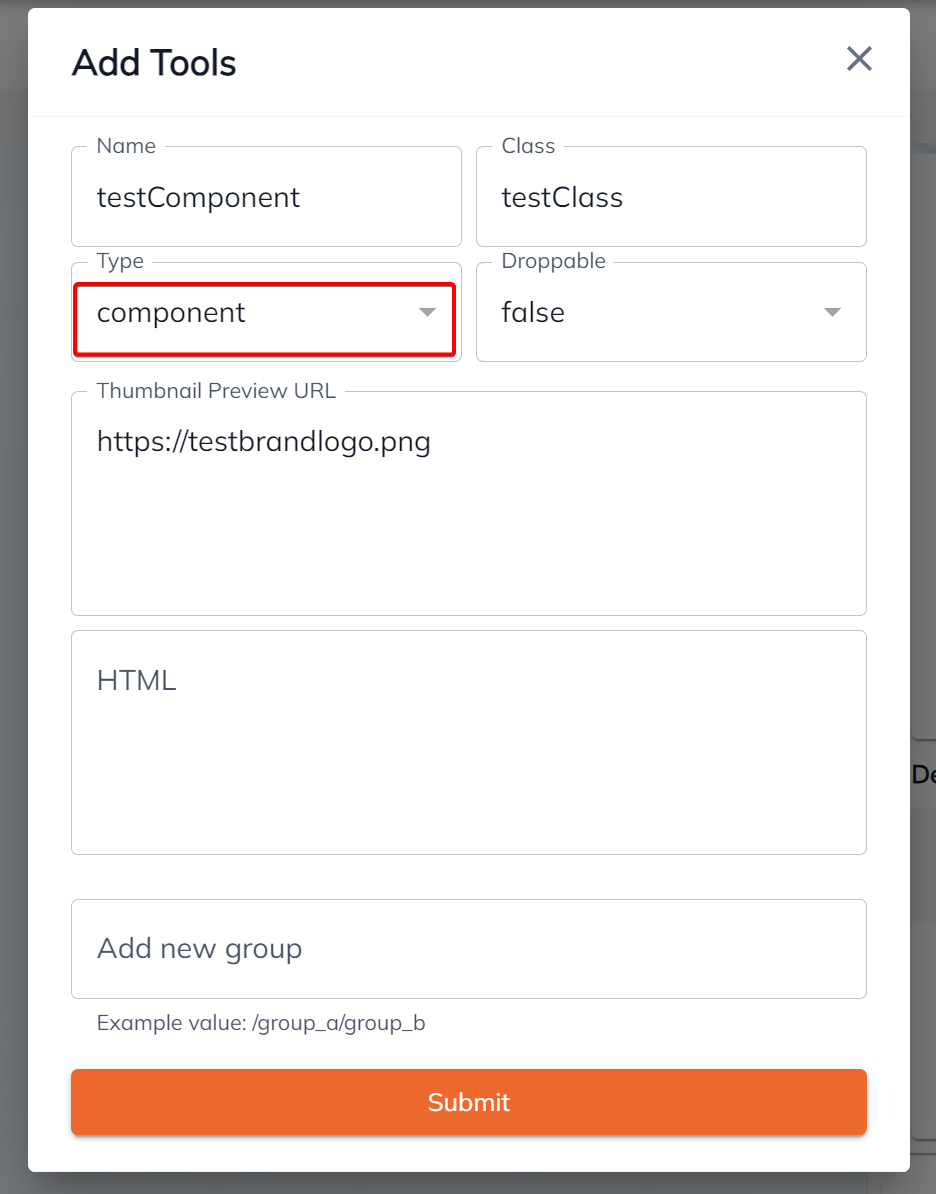
Types of components
There are two options when creating a component: Design and Component
Component
Component is any HTML you would like to display on the layout
Note: If html is left blank, it will automatically wrap your preview url to
<img src={previewURL} width='100%'/>
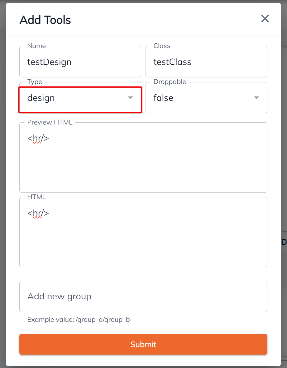
Design
These are intended to serve as elements that can be used for improving spacing or designs such as <br/>, <hr/> etc.
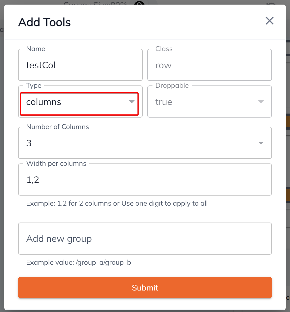
Columns
You can create your own columns and set the width depending on what you like.
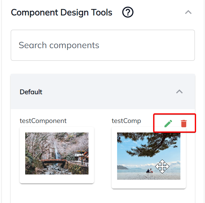
You can also Edit / Delete your existing component.
Updated 1 day ago
Did this page help you?